Multi-band light curves#
In the previous tutorial we saw how to instantiate a Star with a spectral map. Here, we demonstrate how to compute light curves from such a map, which could originate from observing a star at different waveband.
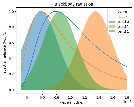
We will assume that the intensity of the quiescent photosphere and its spots can be modeled as blackbodies with different temperatures.
import jax.numpy as jnp
import numpy as np
import matplotlib.pyplot as plt


def planck(wavelength, temperature, normalize=False):
    h = 6.62607004e-34  # Planck constant
    c = 299792458  # speed of light
    k = 1.38064852e-23  # Boltzmann constant
    f = (2 * h * c**2 / wavelength**5) / (
        jnp.exp(h * c / (wavelength * k * temperature)) - 1
    )
    return f / jnp.max(f) if normalize else f


wv = np.linspace(0.5e-6, 3e-6, 200)
We will make measurements in separate bands with a wavelength response function defined as a Gaussian
def gaussian(x, mu, sigma):
    return jnp.exp(-0.5 * ((x - mu) / sigma) ** 2)


np.random.seed(1)
bands_mean = np.random.choice(wv, 3)
bands_response = gaussian(wv, bands_mean[:, None], 0.4e-6)
Let’s visualize some spectra together with our wavebands.
plt.subplot(
    111,
    xlabel="wavelength ($\mu$m)",
    ylabel="spectral radiance ($W/m^2/m$)",
    title="Blackbody radiation",
)
plt.plot(wv * 6, planck(wv, 2200, normalize=True), label="2200K")
plt.plot(wv * 6, planck(wv, 3000, normalize=True), label="3000K")
for i, b in enumerate(bands_response):
    plt.fill_between(wv * 6, b, alpha=0.5, label=f"band {i}")
_ = plt.legend()
We then define a spotted surface using a Gaussian Process, as shown in the GP tutorial
import jax
import tinygp
from spotter.kernels import GreatCircleDistance, ActiveLatitude
from spotter import Star, show

star = Star.from_sides(20, period=1.0, u=(0.1, 0.2))

spot_kernel = 0.001 * tinygp.kernels.Matern52(0.1, distance=GreatCircleDistance())
kernel = ActiveLatitude(
    kernel=spot_kernel,
    latitude=0.5,
    sigma=0.1,
    symetric=True,
)

gp = tinygp.GaussianProcess(kernel, star.x, mean=1.0, diag=1e-8)
spot = gp.sample(jax.random.PRNGKey(2))
spot = np.clip(spot, 0.6, 0.97)
spot = spot / np.max(spot)
Here, we decided to clip the surface to artificially create darker smaller size spots. It is useful to plot the pixel values to get a sense of the map distribution
plt.plot(spot.T, c="0.5")
plt.xlabel("pixel index")
_ = plt.ylabel("brightness")
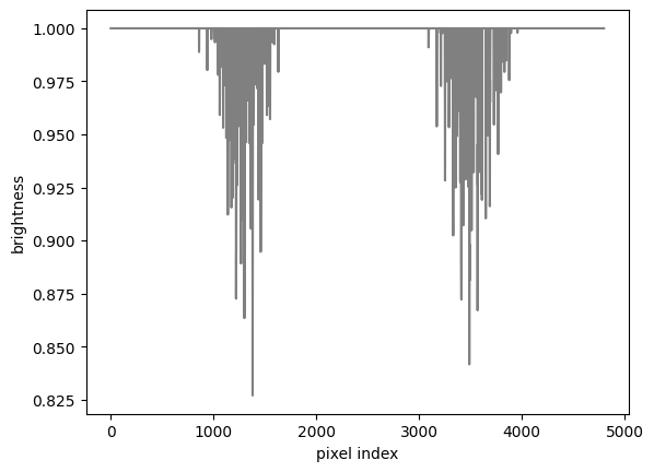
As we can see there are two regions (corresponding to the active latitudes) where pixels have lower values, corresponding to the spots we just drawn.
From there we can define the spectra of the pixels by using the spot map as a temperature map of the surface. Finally, we multiply the spectra of the pixels by the response function of each waveband
# assuming a quiescent photosphere at 3000K
spectral_map = jax.vmap(lambda temp: planck(wv, temp))(spot * 3000)

measured_maps = (spectral_map[:, :, None] * bands_response.T[None, :, :]).mean(1)
star = star.set(y=measured_maps.T)
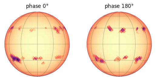
Let’s have a look at the resulting map (here in the first band)
plt.subplot(121, title="phase $0\degree$")
show(star[0])
plt.subplot(122, title="phase $180\degree$")
show(star[0], np.pi)
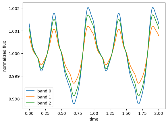
We can now compute the normalized light curves observed at each waveband.
from spotter.light_curves import light_curve

time = np.linspace(0, 2.0, 300)
f = light_curve(star, time)
f /= np.mean(f, 1)[:, None]
for i in range(f.shape[0]):
    plt.plot(time, f[i], label=f"band {i}")
plt.legend()
plt.xlabel("time")
_ = plt.ylabel("normalized flux")